A different narrative for menswear
LAECKEN — Art Direction, Identity, Motion
The Challenge
LAECKEN is the new menswear label by designer and curator Richard van der Laken, bringing together makers and artists from every continent. Most men dress to disappear. LAECKEN does the opposite: it lifts men up, not as an impossible ideal, but as themselves, proud of who they are. The label existed only as an idea. Our task was to build a brand that carried that belief from day one.
The Strategy
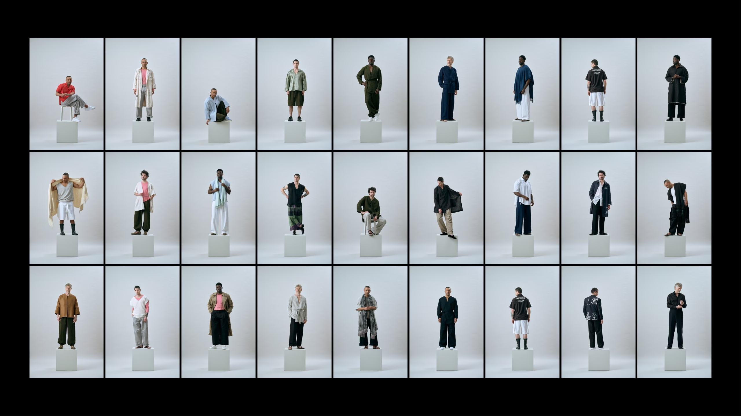
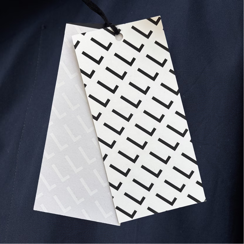
Instead of casting models, we put real men at the centre: a designer, a firefighter, an artist, a documentary maker, each the hero of his own story, not of a campaign. The craft behind the clothes, the fabric, the process, the people who make it, became just as close and personal as the men themselves. To bring these different worlds together, we designed one recognisable sign: the L, an anchor for every maker and every man.
The Solution
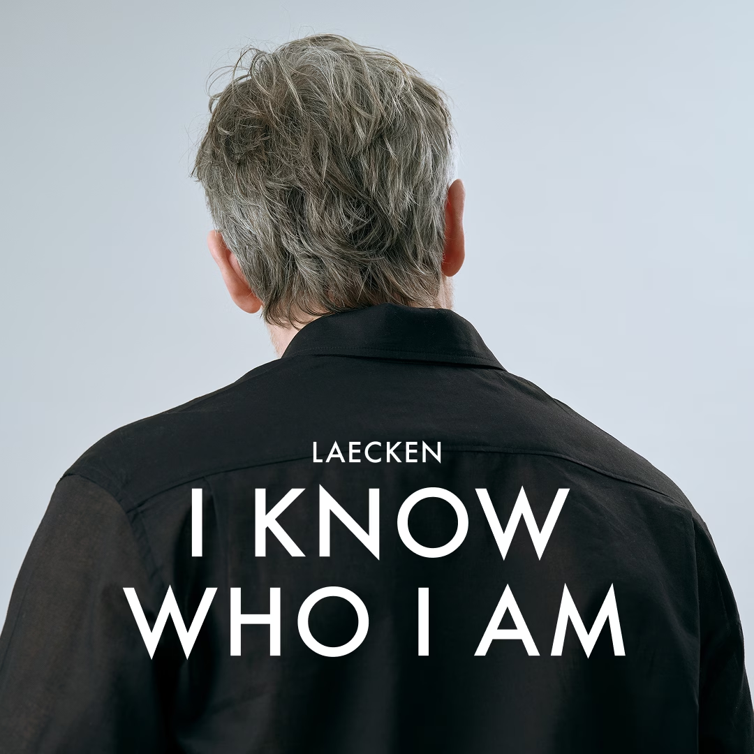
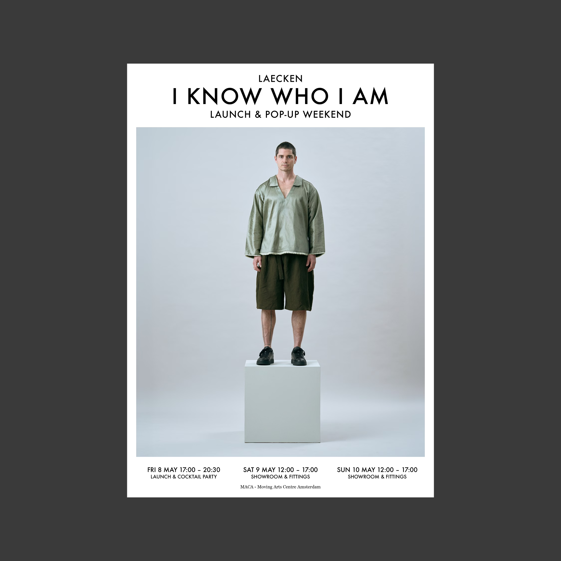
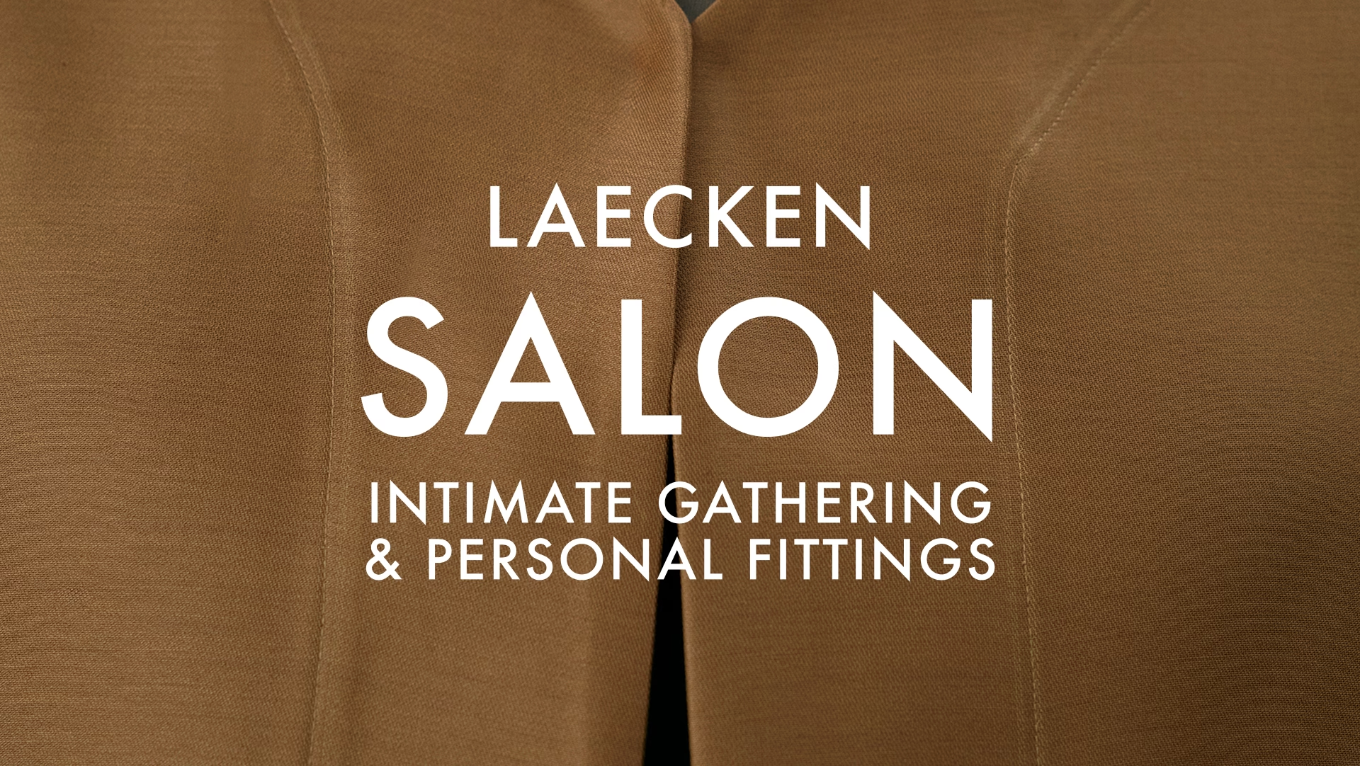
The result feels like a personal invitation, not a display case. The L appears on every label, comes to life in animation and runs through the identity as a signature. In the photography, we put each man on a pedestal, the way a museum presents a sculpture, because that is exactly what the LAECKEN man wants to be: a beautiful man. Close-ups of fabric and detail show the craft behind him. LAECKEN doesn’t just dress a man. It gives him a stage, and lets him stay exactly who he is.
Credits:
Branding & Art Direction – De Designpolitie
Clothing Design & Curation – Richard van der Laken & Femke van Gemert
Event Direction – Xander Straat
Production – Maikel van der Laken
Photography – Mounir Raji
Next project
Two parties, one progressive movement.
Progressief Nederland – Campaign, Event design, Identity, Motion