What would the world be without images?
Pictoright — Identity, Motion, Strategy
The challenge
Pictoright protects the copyrights of artists, photographers, illustrators and designers: creatives whose work shapes how we see the world. Yet the value of their work often goes unnoticed. The challenge was to create a visual identity that not only represents Pictoright’s mission but also sparks conversation about the essential role of images in our daily lives.
The strategy
Rather than designing around copyright or legal protection, we anchored the brand in a provocative question: what would the world look like without images? It shifted the focus from the technicalities of rights management to the cultural and emotional value of visual creativity. The strategy was to make the invisible visible, by showing the void that would exist without the work Pictoright protects.
The solution
We built the identity around the metaphor of the empty frame: a simple yet powerful symbol of absence and potential. It became the foundation of a timeless design system:
– a minimalist visual language with the frame at its centre;
– flexible applications of the empty frame across media, reinforcing the question and inviting reflection;
– a durable system that has stayed relevant and distinctive for more than 16 years.
The result is a brand that doesn’t just represent Pictoright, but challenges perceptions and celebrates the irreplaceable value of the images it protects.

PictoWrite
PictoWrite is a custom, bitmap-inspired typeface that reflects the growing influence of digital media on how images are used. Bold and blocky, it makes Pictoright instantly recognisable everywhere.
The PictoGrid
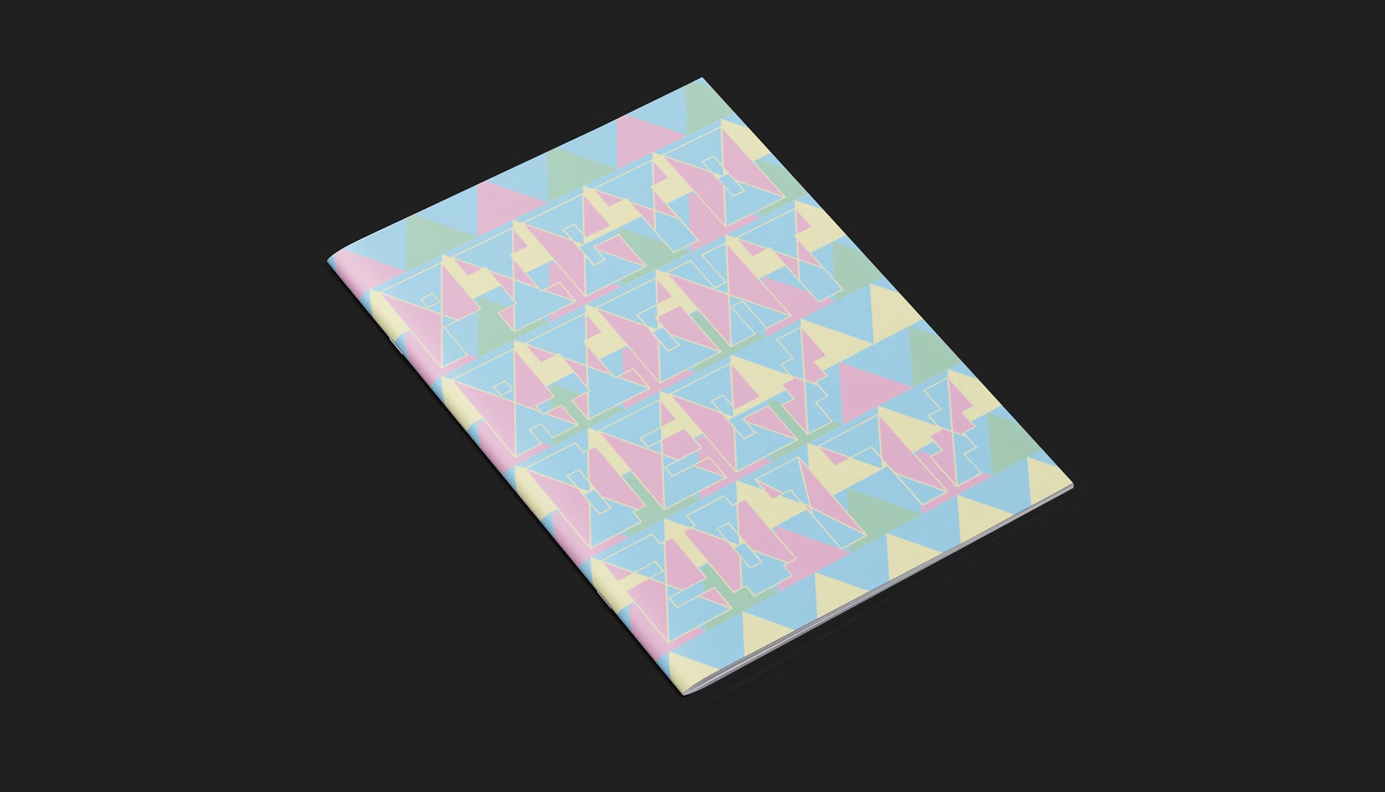
The empty frame also became a tool: the basis of a grid. It generates patterns, layouts and graphics, giving Pictoright a bold, flexible visual system that keeps pointing to what it stands for: protecting creative work.


Next project
Design like you give a damn.
What Design Can Do – Event design, Identity, Motion