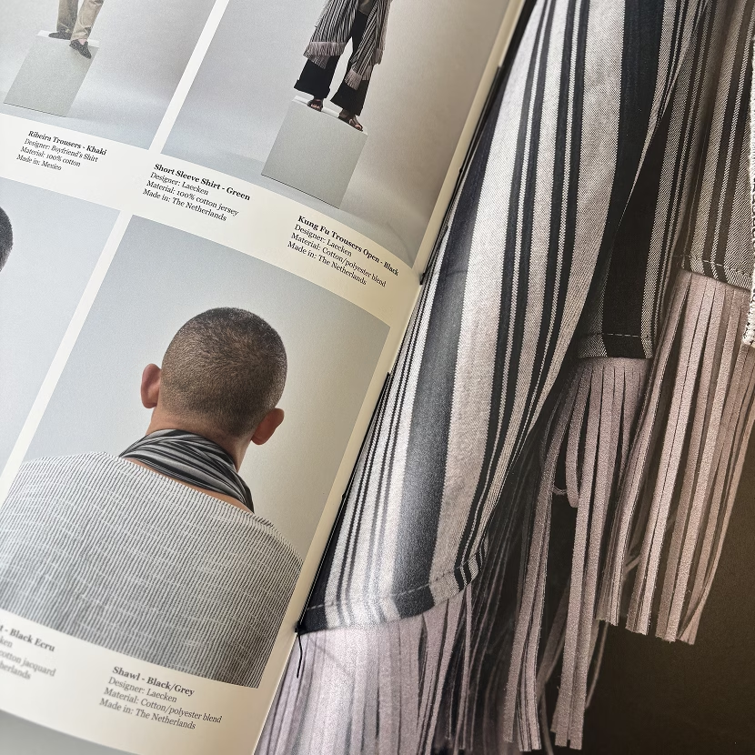
Identity, Event Design, August 2026
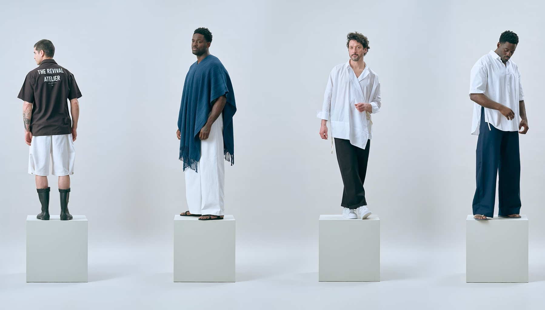
Laecken is a new fashion label founded by Richard van der Laken, born from his desire to give men more freedom to express themselves through clothing, accessories, jewellery and textiles, confidently, unapologetically and with style.
The label draws inspiration from the world around us, looking to places such as Mexico, Japan, Hong Kong, India and Ghana, where centuries of heritage, craftsmanship and innovation have shaped the way people dress and express themselves.

Geometry and simplicity.
Laecken draws inspiration from places such as Mexico, Japan, Hong Kong, India and Ghana, where centuries of craftsmanship and textile traditions have shaped how people dress and express themselves. At its heart is a fascination with the simple geometry of traditional menswear: rational forms that feel timeless, clear and elegant.
That same simplicity became the starting point for the identity. We reduced the logo to its most basic form: a single L. Simple, recognisable and strong — a geometric mark that gives Laecken a clear visual foundation.