Progressief Nederland
Merging two parties into one progressive movement.
Progressief Nederland — Campaign, Event Design, Identity, Motion
The Challenge
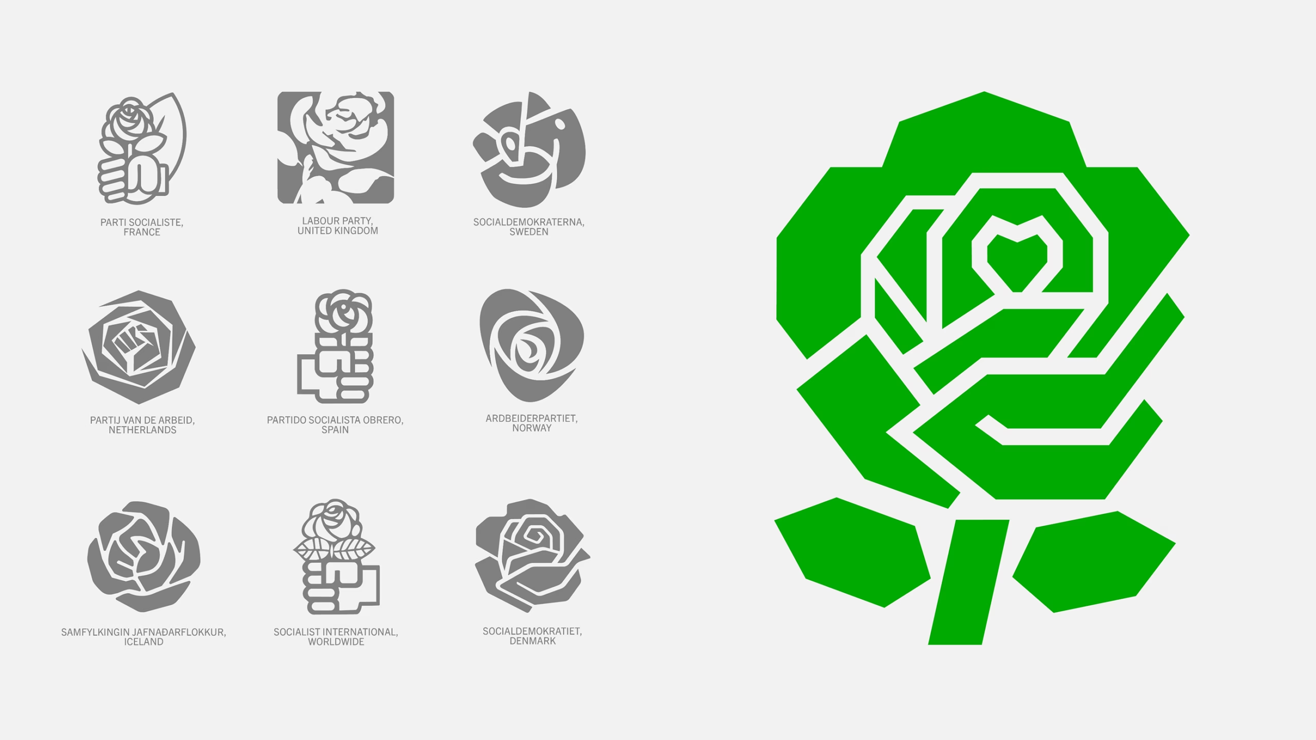
Merge the Netherlands’ two leading left-wing parties, the Social Democrats and the Greens, into a single progressive movement. The new identity had to balance heritage and change, unite diverse supporters, and provide a lasting symbol for the future of the Dutch left.
The Strategy
Create a brand with two layers: a clear political identity and a deeper cultural layer that fosters belonging, participation, and shared ownership. Inspired by sports fan culture, the goal was to build not just a party, but a movement people actively want to be part of.
The Solution
We developed a flexible visual system inspired by heraldry and symbolism, connecting local chapters, supporters, and national campaigns through a shared identity. Designed for participation as much as communication, it works across activism, demonstrations, campaigns, and social media.
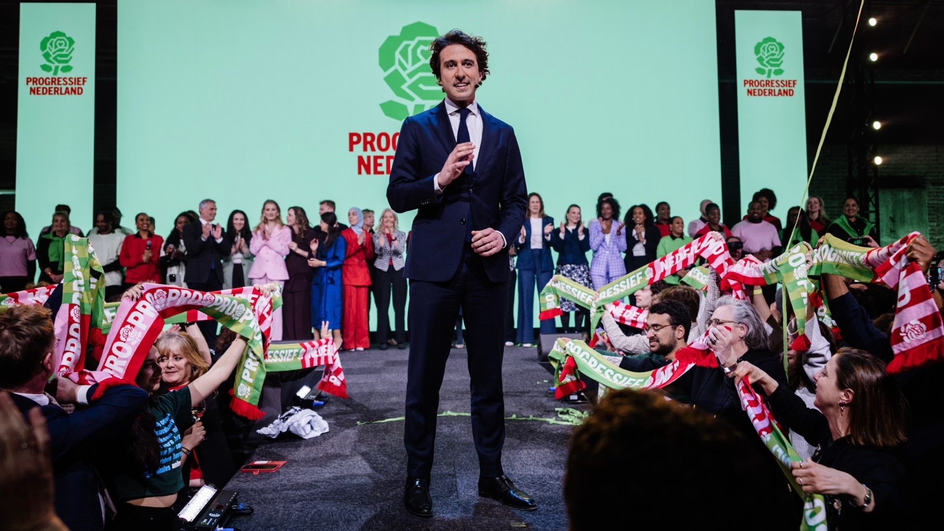
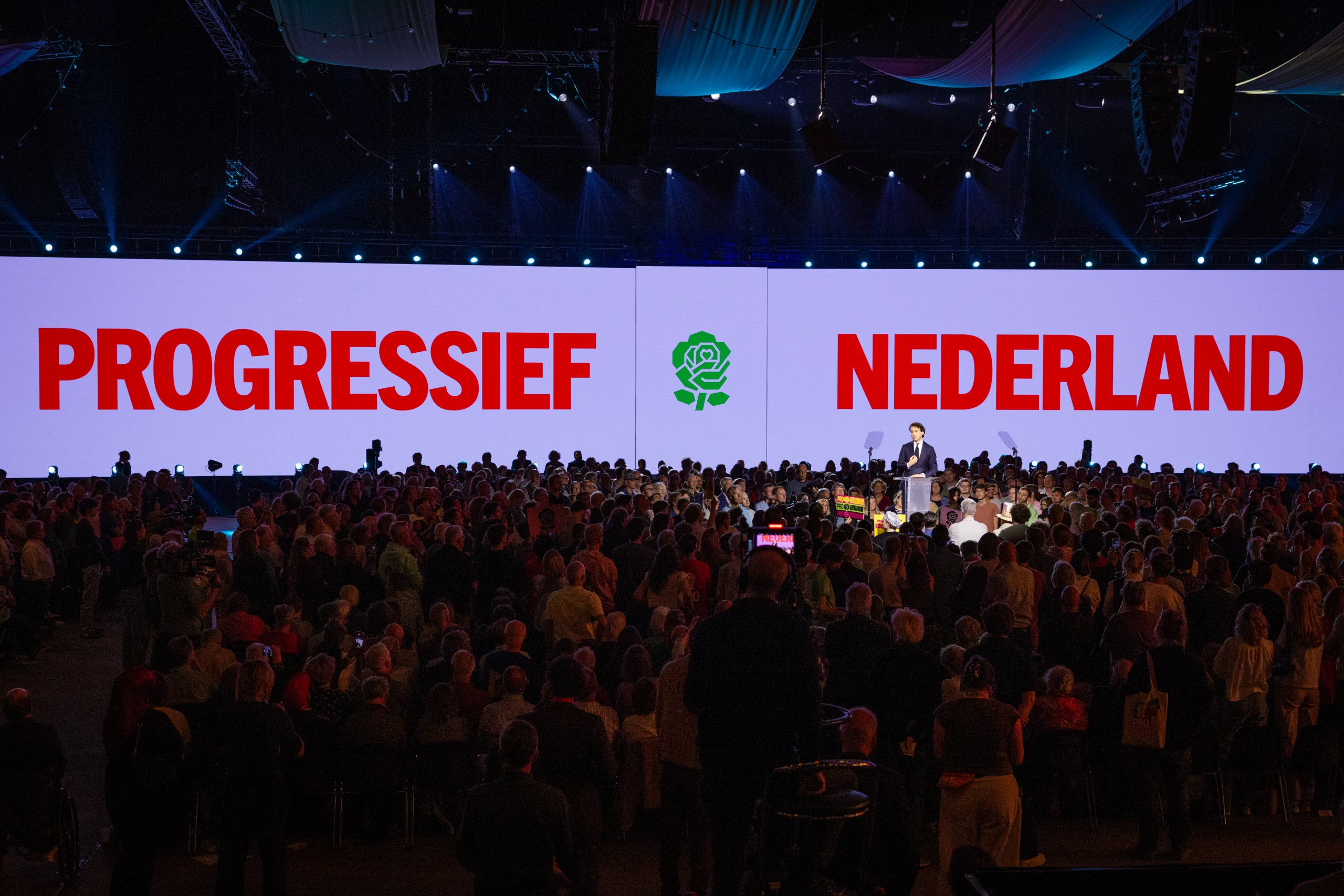
Launch campaign
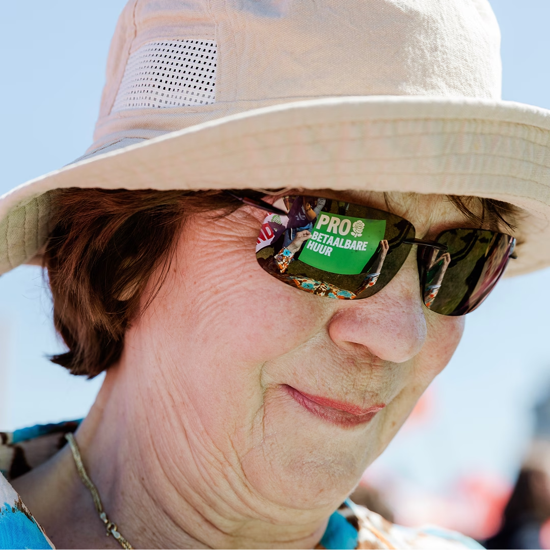
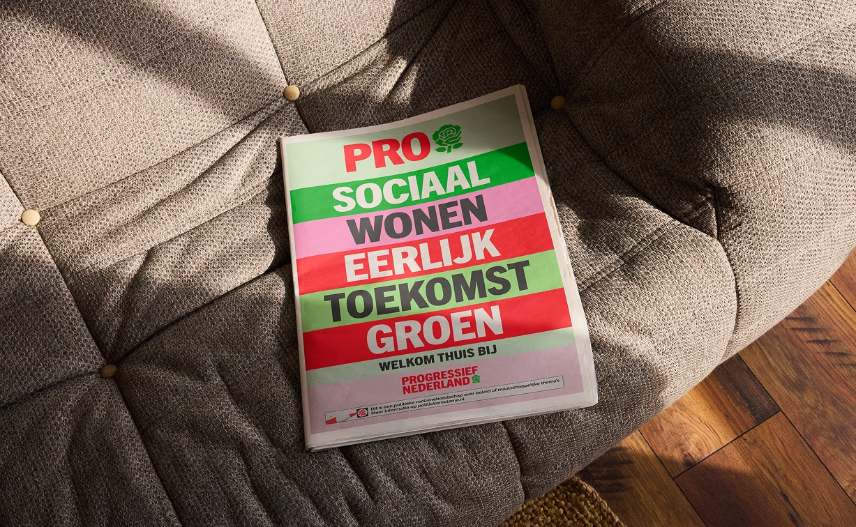
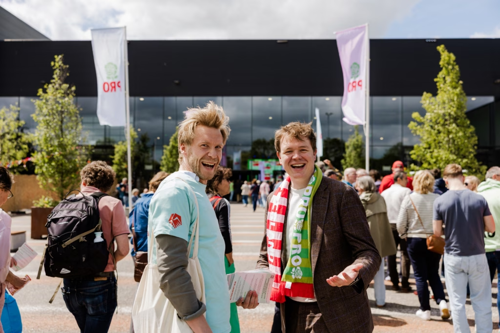
To introduce Progressief Nederland, we developed a campaign around the simple idea: not being against things, but being PRO. We turned it into a communication system manifesting the party’s values. PRO Future. PRO Education. PRO Environment.
Graphic system
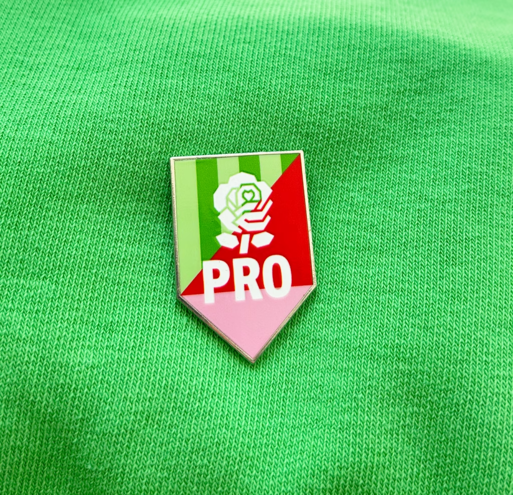
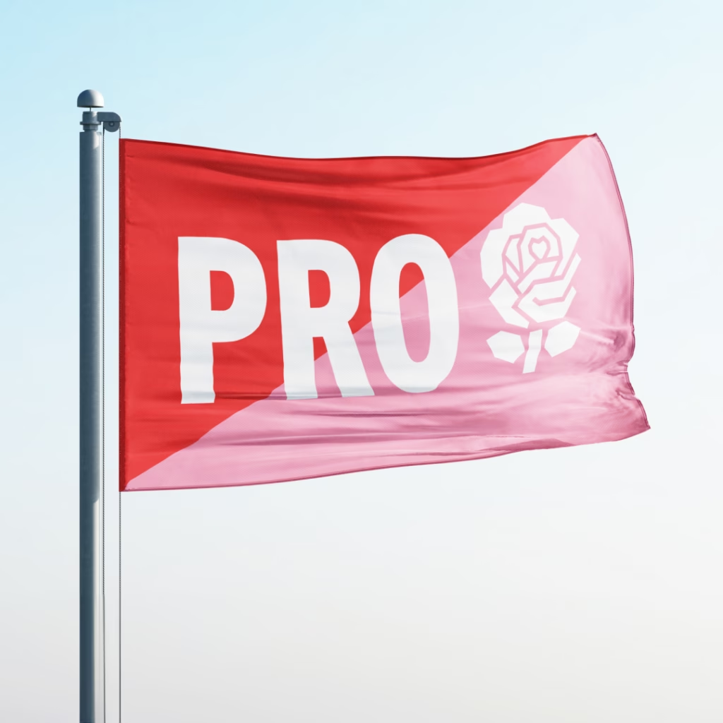
We created a visual system inspired by the flags and coats of arms of the Dutch provinces. Drawing from the traditions of heraldry, we developed a pattern system using the visual principles of sport, where symbols, colours and patterns become expressions of collective identity.
Credits:
Strategy and Narrative – David Snellenberg
Art Direction and Narrative – Emilio de Haan
Event Director – Xander Straat
Production – Maikel van der Laken
Film Director – Bram Schouw (Bonkers)
Music – Niels den Otter (Audentity)
Photography – Noes Petiet
Netherlands Cancer Institute
A brand driven by discovery.
Netherlands Cancer Institute — Identity, Motion, Strategy
The Challenge
The Netherlands Cancer Institute (NKI), part of the Antoni van Leeuwenhoek hospital, is one of the world’s leading cancer research centres. But its brand didn’t reflect the energy inside its walls. It felt institutional, academic and rooted in the past, while the institute itself is driven by a new generation of bold, curious researchers.
The Strategy
Rather than building the brand around the institution, we built it around the people. The scientists behind every breakthrough. Researchers with bold ideas, curious minds and an unwavering drive to push science forward. Their spirit became the core of our strategy.
The Solution
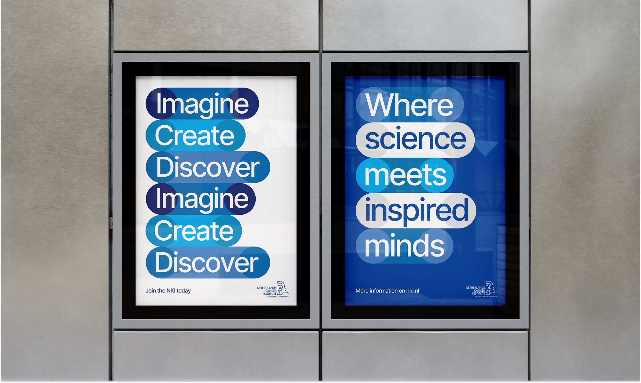
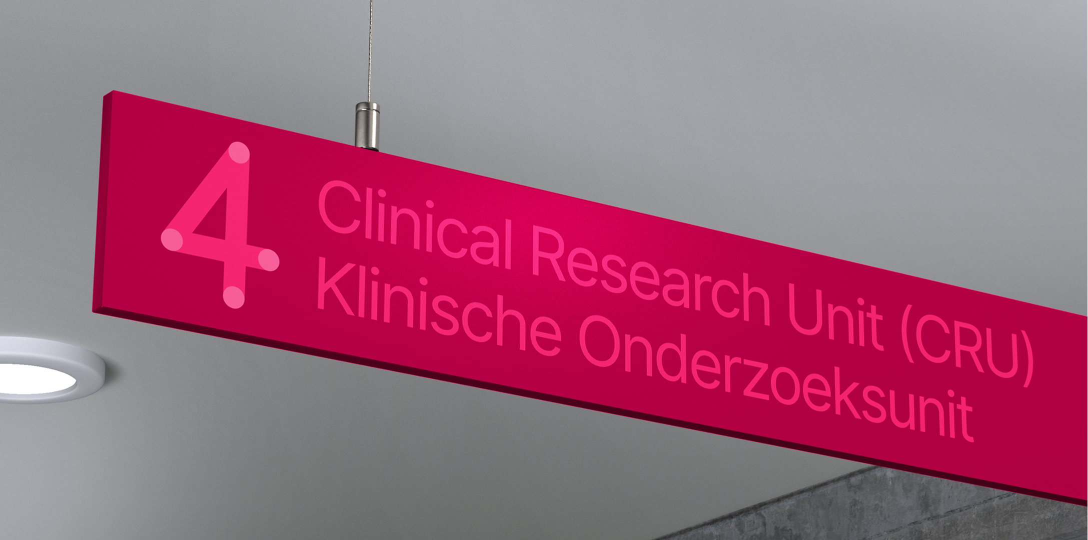
Building on the existing logo, we introduced a fresh approach to their visual identity, creating a recognisable visual system built around colourful cells. Reflecting on how breakthroughs occur, the cells link, cluster and play off each other, putting the voices and visions of the young researchers first.

In conversation with Karlijn
“Branding is really about who you are and how you come across. The NKI used to come across as serious and rigorous. The new identity aims to shift that perception. For NKI, that means showing not only our leading position, but also more of our playfulness and boldness.”
Karlijn van Driel – Senior Communications Advisor at NKI
Movies That Matter
Every screen matters.
Movies That Matter — Identity, Strategy
The Challenge
Elevate the branding and campaigns of Movies That Matter, a festival with a 30-year legacy of advocating for human rights through film. The goal was to create a visual identity that reflects the festival’s global reach, urgency, and impact—from its annual event in The Hague to year-round initiatives like screenings, educational programs, and support for independent filmmakers.
The Strategy
Develop a brand that captures the power of film as a tool for change, balancing the festival’s prestige with its grassroots mission. The identity needed to be bold, inclusive, and adaptable, serving as a platform for stories that inspire action, whether on screen, in classrooms, or at partner festivals worldwide.
The Solution
We crafted a unified visual system that amplifies Movies That Matter’s voice across all touchpoints—festival branding, digital campaigns, school screenings, and global partnerships. The result is a brand that doesn’t just showcase films but ignites conversations and drives human rights forward through the power of storytelling.
Screen-based concept
We increasingly see the world through a variety of media—mobile, online, outdoors, television, social media and the traditional cinema. The most used screen dimensions combined with the basic colour palette of video form the basis of the logo and identity system for Movies that Matter.




Human, Right?
Festival campaign
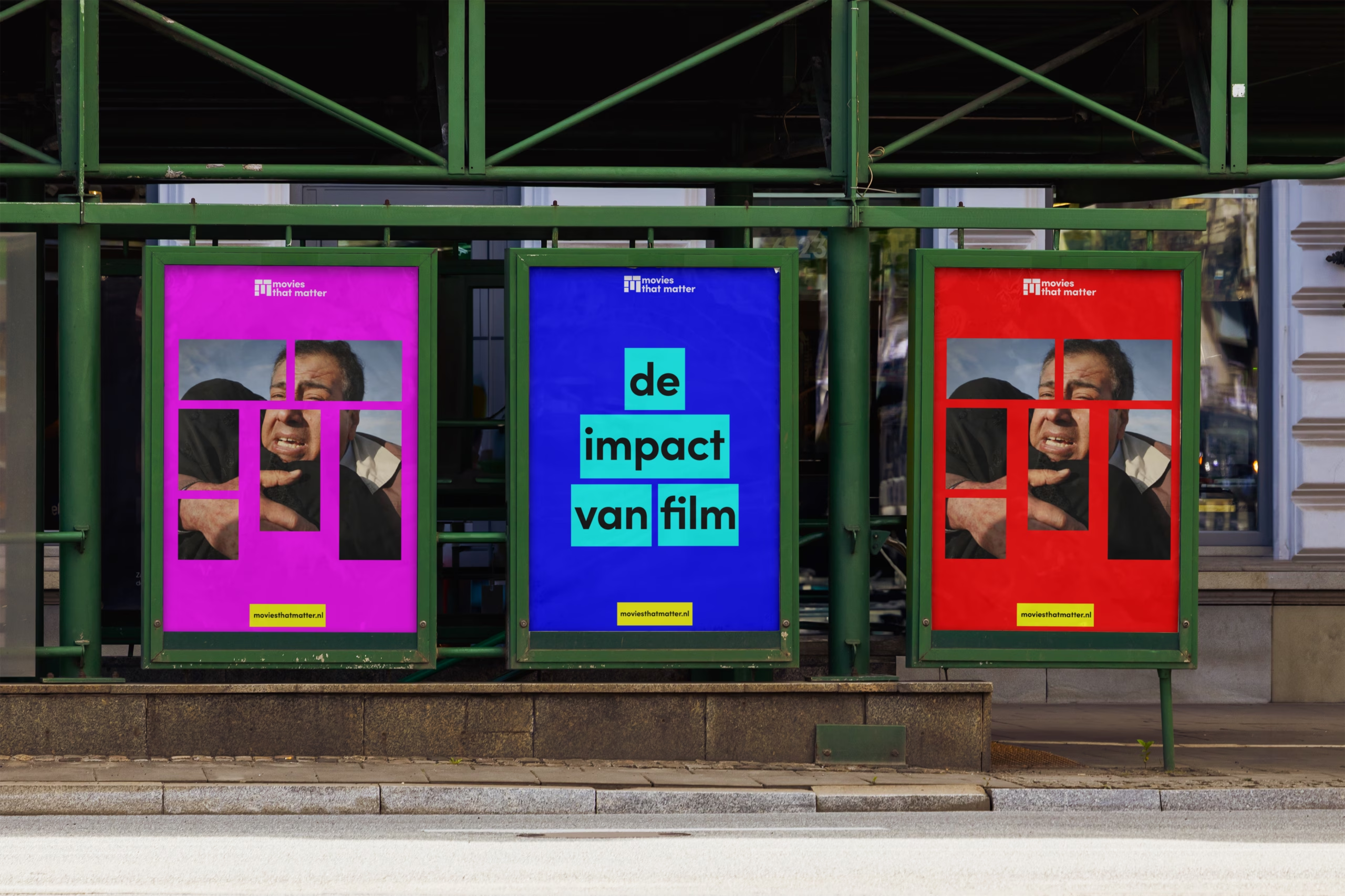
For the 2024 edition of the Movies that Matter Festival, we developed the campaign human, right?, a title that challenges perceptions of justice and humanity. The visual language builds on the identity’s core screen shapes, reimagining them as rolling film strips. This dynamic system was applied across digital and print, ensuring a cohesive presence from social campaigns to city-wide posters.


Vereniging Eigen Huis
Uniting all home owners under one roof.
Vereniging Eigen Huis — Identity, Strategy, Typography
The Challenge
Vereniging Eigen Huis is the Netherlands’ largest homeowners’ association, dedicated to making homeownership clearer and more accessible through independent advice, legal support, and advocacy. However, their brand lacked the warmth and approachability needed to resonate with a diverse audience of homeowners. The existing identity felt formal and institutional, failing to reflect the association’s mission to empower and guide people through one of life’s biggest investments.
The Strategy
Instead of focusing solely on the association’s services, we centered the brand on the people it serves—homeowners navigating the complexities of property ownership. We aimed to humanize the brand, making it feel like a trusted partner rather than a distant authority. The strategy was to create a visual system that felt friendly, clear, and personal, aligning with the association’s role as a supportive guide.
The Solution
With the existing logo preserved, we developed a cohesive and dynamic visual system to bring the brand to life. This included:
- A custom typeface to enhance readability and brand distinctiveness.
- Friendly illustrations and graphs to simplify complex information, making it more engaging and accessible.
- A flexible layout system that adapts across platforms, ensuring consistency while allowing for creative expression.
- Thoughtful photography that reflects the real-life experiences of homeowners, adding authenticity and emotional connection. The result is a brand that feels approachable, modern, and human, while maintaining the professionalism and trustworthiness that Vereniging Eigen Huis is known for.
A friendly touch
The identity for Vereniging Eigen Huis is designed to make the world of housing and homeownership approachable and easy to understand. Playful house shapes, rounded typography, and clear design choices strip away complexity and create a welcoming look and feel. The result is an accessible, human identity that helps everyone feel at home in a subject that can often seem complicated.


What’s tough to explain, we made visible
To tackle complex topics, we developed a distinctive set of illustrations. Simple, direct, and full of character. These visuals bring abstract concepts down to earth, making them accessible and relatable. From clear, data-driven infographics to isometric house layouts, the illustration style forms a versatile toolbox that is used across campaigns, reports, and digital platforms.
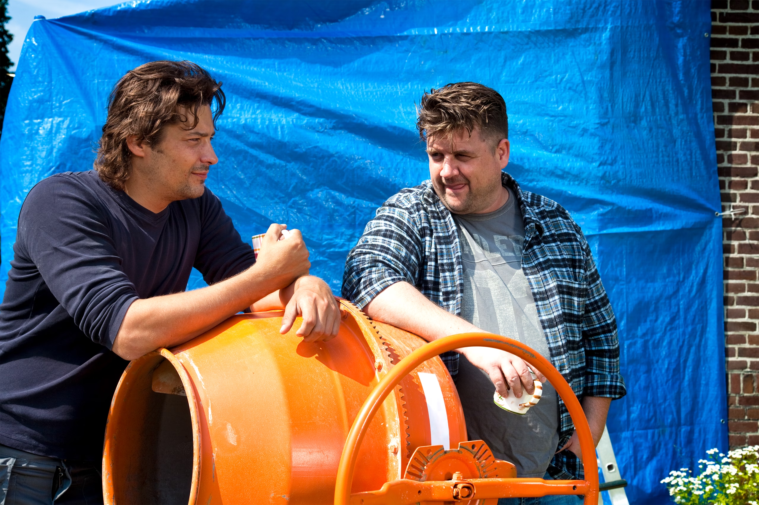


From a custom typeface to photoshoots
For Vereniging Eigen Huis, typography and photography carry the core of the identity. Every touchpoint needs to communicate clarity, warmth, and a straightforward attitude. Next to the visual language and custom typeface, we art-directed photoshoots that capture the full spectrum of homeownership, celebrating the everyday joys while also acknowledging the challenges. The combination of honest photography and distinctive typography ensures a cohesive visual language that feels both real and relatable.


What Design Can Do Delhi
Weaving perspectives.
What Design Can Do Delhi — Event Design, Identity, Motion, Typography
The Challenge
Launch What Design Can Do Delhi as a platform to bridge global design thinking with local action. The campaign needed to reflect the city’s vibrant, chaotic energy while positioning design as a catalyst for addressing its most pressing challenges.
The Strategy
Create an identity that mirrors Delhi’s dynamic complexity—a visual and conceptual framework that invites designers, diplomats, activists, and architects to collaborate. The goal was to turn the festival into a common ground for diverse perspectives, fostering solutions tailored to local issues.
The Solution
We developed a cohesive identity, campaign, and on-site assets that embodied Delhi’s spirit while maintaining WDCD’s global brand. The result was a festival that didn’t just discuss change—it activated it, using design to turn local challenges into opportunities for innovation.

Custom Typeface
At the core of the identity, a custom display version of the household typeface Franklin Gothic rebuilt using the logic of weaving—where horizontal and vertical lines are used to create letters.
The typeface acts as the key element of the identity and makes every touchpoint recognisable, instantly.


From typeface to graphics
From the letterforms, we built a flexible pattern system — a treatment that moves easily across print, digital, signage, and stage. The patterns expand the visual language without breaking it. They add energy, depth, and variation, but always trace back to the original forms.


Scalable system
This systematic approach made it easy to scale the style across every part of the festival. From large-scale stage backdrops to directional signage, from merchandise collections to social media campaigns — every touchpoint an extension of the other.


Pictoright
What would be a world without pictures?
Pictoright — Identity, Motion, Strategy
The Challenge
Pictoright is the organization that safeguards the copyrights of artists, photographers, illustrators, and designers—creatives whose work shapes how we see the world. Yet, the value of their contributions often goes unnoticed or undervalued. The challenge was to create a visual identity that not only represents Pictoright’s mission but also sparked conversation about the essential role of images in our daily lives.
The Strategy
Rather than designing around the concept of copyright or legal protection, we anchored the brand in a provocative idea: What does the world look like without images? This question reframed the discussion, shifting focus from the technicalities of rights management to the cultural and emotional impact of visual creativity. The strategy was to make the invisible visible—highlighting the void that would exist without the work Pictoright protects.
The Solution
We built the identity around the metaphor of the “empty frame”—a simple yet powerful symbol of absence and potential. This concept became the foundation of a timeless design system, including: * A minimalist visual language that lets the idea of the frame take center stage. * Flexible applications of the empty frame across media, reinforcing the question and inviting reflection. * A durable system that has remained relevant and distinctive for over 16 years, proving the strength of a big idea executed with restraint. The result is a brand that doesn’t just represent Pictoright—it challenges perceptions and celebrates the irreplaceable value of the images it protects.

PictoWrite
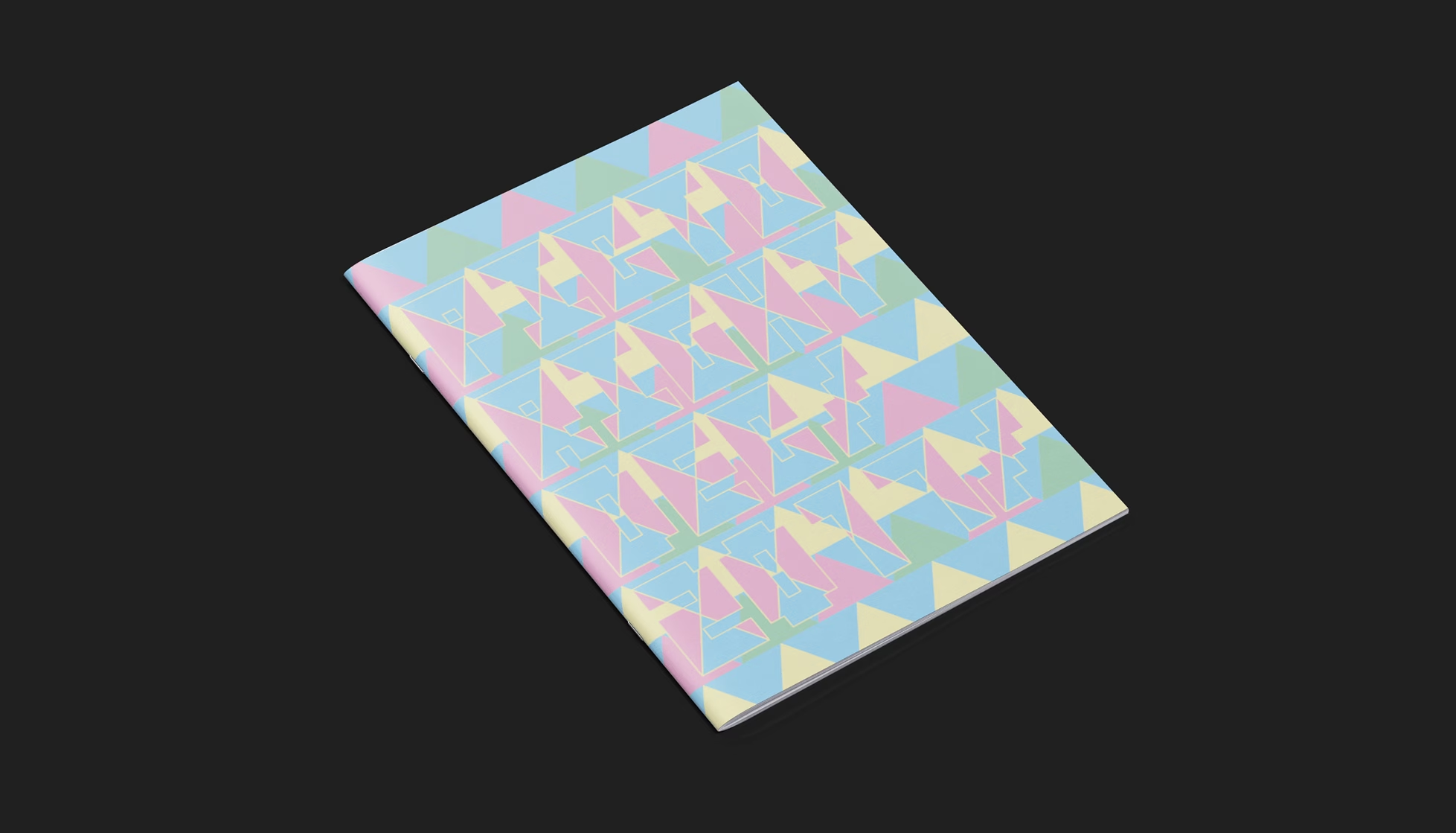
PictoWrite is a custom bitmap-inspired typeface that represents the growing influence of digital media on image use. Being bold and blocky, it’s a tool that makes Pictoright instantly recognizable everywhere.
The PictoGrid
The empty frame became a tool, and the basis of a grid. This structure builds patterns, layouts, and graphics, giving Pictoright a bold and flexible visual system while reinforcing its role in protecting creative work.


KPN
Connecting the Netherlands.
KPN — Annual Report, Campaign, Film
The Challenge
As the leading provider of telecommunications and IT services in the Netherlands, KPN wanted its Integrated Annual Report to do more than communicate financial performance. The challenge was to engage a broader audience—connecting with stakeholders, customers, and the public by showcasing not just the corporation’s achievements, but the human impact of its work. How could a report about numbers and infrastructure also tell the stories of the people and communities it serves?
The Strategy
Instead of presenting a traditional, data-heavy report, we designed the narrative around two parallel perspectives:
- The hard facts—KPN’s corporate performance, innovations, and strategic milestones.
- The human stories—the real-world impact of KPN’s services, as experienced by people across the Netherlands.
To bridge these perspectives, we introduced a thought experiment: What if we reduced the Netherlands to 100 people? What would this look like? This approach made complex data relatable, turning statistics into recognizable, human-scale stories.
The Solution
We created a dual-narrative report, seamlessly blending data and storytelling across online and offline formats. The design included:
- A statistical microcosm—scaling national data down to a village of 100 people, making trends and impacts tangible.
- Visual storytelling that paired corporate achievements with the personal experiences they enable, from families staying connected to businesses thriving.
- A cohesive, accessible layout that invited readers to explore both the numbers and the narratives, ensuring engagement from both analytical and emotional perspectives.
The result was an Integrated Annual Report that didn’t just inform—it connected, transforming KPN’s story into one that resonated with everyone, from investors to everyday users.
Connected by KPN
In “Connected by KPN” a cross section of Dutch society is presented in a microsite containing 100 short films of 100 people talking about the role of telecommunication and digital tools in their lives.


Connected to the future
In “Connected to the future” we explored 15 trends in technology that will change the way we live and work in the near future. The micro site featured 15 split-screen videos with experts an scientists talking about topics like artificial intelligence, the internet of things, virtual reality, quantum computing and smart cities.
Everyone connected
The third instalment of the reporting series focused on KPN’s social corporate responsibility programmes. By supporting various initiatives with technological and financial support KPN tries to make sure that no-one is left behind in our increasingly individualistic society. In collaboration with journalist Gian van Grunsven we produced a documentary that researched the status of social interaction in a digital world.


What Design Can Do
Design like you give a damn.
What Design Can Do — Event Design, Identity, Motion
The Challenge
Establish What Design Can Do as a global movement that harnesses design to address major societal challenges. The initiative needed a bold, flexible identity that could unify its mission under a single, recognizable brand—one that felt urgent, actionable, and universally relevant.
The Strategy
Create a minimal yet powerful graphic system built on just four core elements: yellow and red, a typeface, and a bold brushstroke. The simplicity ensures clarity and adaptability, while the boldness reflects the initiative’s call to action: Design like you give a damn.
The Solution
The resulting identity is instantly recognizable—both in the Netherlands and abroad. By consistently applying these elements, the brand has become synonymous with design-driven impact, proving that restraint and purpose can create a movement as powerful as the causes it champions.
Design Festivals
On a mission to inspire creatives around the world we’ve produced multi-day design festivals in Amsterdam, São Paulo, México-City and Delhi. Custom festival brands, online, PR and out of home campaigns helped to draw in over 15,000 design enthusiasts.


Design challenges
Next to bringing inspiration we’ve challenged designers to actively participate in tackling societies most urgent issues like climate change, the plight of refugees and other social topics. Since 2016 over 10,000 participants have joined the challenge programme. For each programme a project brand and recruitment campaign was developed under the umbrella of the WDCD brand.
Publishing
With communication campaigns, PR and via online and print publications we’ve managed to reach a larger audience with WDCD’s messaging. The signature yellow is ever standing out like a strong beacon in an oversaturated visual world.


De Groene Amsterdammer
The world according to De Groene.
De Groene Amsterdammer — Illustration
The Challenge
Strengthen the visual identity of De Groene Amsterdammer, the Netherlands’ leading opinion magazine, by creating distinctive and thought-provoking graphics that reflect its intellectual depth and cultural influence.
The Strategy
Contribute a regular visual column (Gorilla), cover art, and illustrations that align with the magazine’s tone—sharp, insightful, and visually striking. The goal was to make complex ideas accessible and engaging through bold, iconic graphics.
The Solution
We developed a signature visual language that became synonymous with De Groene Amsterdammer, including the Gorilla column and campaign materials. These graphics not only enhanced the magazine’s editorial content but also became the face of its marketing, reinforcing its brand as a leader in thought and design.


Covers and illustrations
Over the years we have provided visuals for topics like politics, technology, law, crime, international relations, media, business, finance and the evils of Nutella.


The Groene world
In need of a recognisable mascot for marketing purposes we developed Harry & friends, a family of characters that carry all the knowledge of the world on their shoulders—one of the many perks of being a De Groene reader.


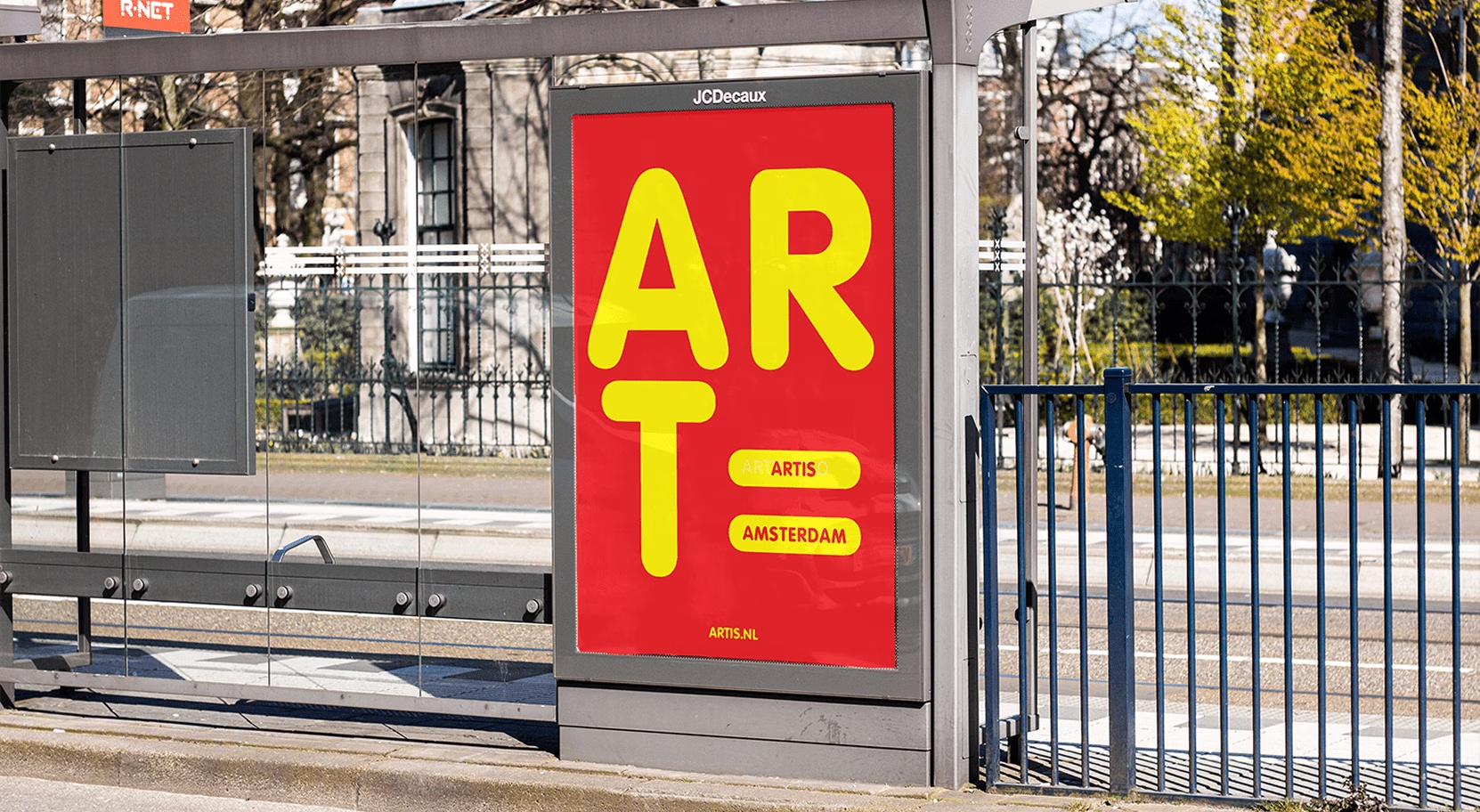
Artis
Nature can be found in almost everything.
Artis — Campaign
The Challenge
Reframe Artis (Amsterdam Zoo) as a place where nature and artistry intersect. The goal was to reveal the hidden beauty and intelligence in the natural world, encouraging visitors to see familiar creatures—and even the zoo itself—in a fresh, thought-provoking way.
The Strategy
Use Pablo Picasso’s bull-head sculpture as inspiration to demonstrate how nature’s forms can be reimagined through an artistic lens. The approach was to treat the zoo not just as a conservation space, but as a living gallery where every animal and exhibit invites discovery and wonder.
The Solution
We developed a campaign that transforms the zoo’s creatures and environments into playful, artistic compositions, starting with the Picasso-inspired bull and expanding across the entire zoo. The result is a brand that sparks curiosity, blending science, art, and nature into a cohesive and engaging experience.